EDITORIAL - That new PAGCOR logo

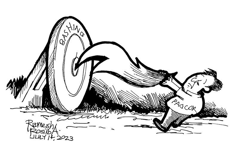
On the occasion of the 40th anniversary of their founding, the Philippine Amusement and Gaming Corporation (PAGCOR) has unveiled a new logo. We can’t fully describe it here, just look it up online if you want to see it. Suffice it to say it’s one that quickly draws mixed reactions.
As mentioned in an online news report, PAGCOR chairman Alejandro Tengco said the new logo “incorporates the element of fire associated with energy, inspiration, passion, and transformation. It symbolizes the flame that ignites change and drives progress. The logo likewise reflects a beacon which symbolizes guidance, leadership, and direction. It represents a guiding light that helps people find their way.”
As if reminiscent of the recent brouhaha involving the new slogan of the Tourism department’s campaign, the new logo is causing much controversy.
Many didn’t know what to make of it. Some called it a work of genius, while others say it looks like demon head with blue horns, and others say it looks like a shrimp. Others saw a P and a C instead of a P and a G. But never mind the design; we all appreciate art in different ways.
We are not even questioning why they saw the need for a new logo. Although this is a legitimate issue in itself, it is the right of any office to change the image that represents it whether or not there is really a reason to do so. In this case, PAGCOR may say their 40th founding anniversary is such a cause.
But was the logo worth the ?3 million allegedly paid for it? Isn’t this too much?
We know quality is worth paying for, but judging from the reactions people are making we might have overpaid for this service. Perhaps PAGCOR forgot that the government was supposed to be in a “tight fiscal situation” with little room to maneuver.
For all our faults, Filipinos are actually gifted visual artists. We are sure PAGCOR wouldn’t have had any trouble finding someone to design the new logo without breaking the bank, or whose design didn’t cause so much confusion.
- Latest


