The power of color to elevate the home

Neutrals may have been a source of comfort while at home, but after spending all that time indoors, a certain ennui may have set in, requiring pops of color to bring renewed energy to our nest as well as our lives. Color psychology, after all, has been an indispensable tool in designing the interiors of a room, making a huge impact on the mood of a space more than any other factor.
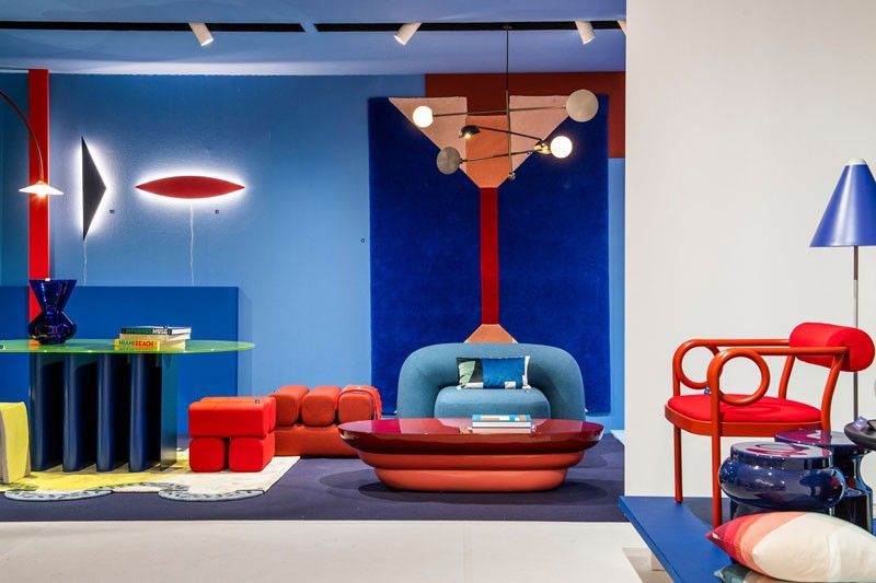
“A rich, thoughtful palette energizes and sets the tone for interiors, just as it provokes our senses and emotions,” according to Maison & Objet trend forecaster Elizabeth Leriche, who proposes “Colour Power” that calls for shock therapy to counter the ambient doom.” It’s a new language made up of strong, chromatic contrasts and bright colors that liven up the scenography of spaces to go beyond five senses — a bit of the ’70s, a bit of modernism — a collaboration of colors and material exploration to create a singular eccentric character.
“Color is imposed today as a powerful antidote to the incessant tide of crisis and the tendency towards uniformity of international aesthetic principles,” says Leriche. The new way of using color asserts itself as a manifesto and identifies itself as a process of risk taking. It reflects a desire, a certain freedom and even an outlet for our emotions. “The colors and the subtle combination of shades immediately ignite our imagination with their evocative power, but also thanks to the variety of cultural, historical and geographical references linked to them all over the world.”
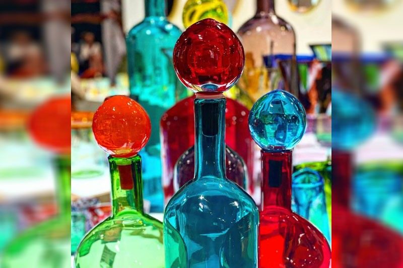
A strong color trend to emerge at the premier Paris fair was teal, which is achieved by mixing blue with green pigments into a white base and deepened with black. In varying shades from a medium to a deep tone, this color is quite versatile because it actually originates from nature, as seen in ducks and peacocks. It projects a certain sophistication and elegance, as well as a vintage appeal, which is very au courant with the call for recycling and sustainability.

Neon shades have always evoked fun, frivolity and excess, making the boldest one — neon red — a popular shade this season. The intensity of red raises a room’s energy level and pumps the adrenaline. It’s associated with ambition and action, making it a great option for home offices and creative spaces. It’s also ideal for the living room or dining room since it draws people together and stimulates conversation. Red contrasts perfectly with last season’s mustard yellow, making it easier to incorporate the new red accessories and furnishings with existing pieces.

Sapphire, named after the gemstone, is a beautiful, strong blue color. It can also veer towards Klein blue, a deep blue hue formulated by Yves Klein, who fell in love with the shade during his days in the French Mediterranean, where the deep cerulean skies captivated him. Evoking island holidays of endless sea, open spaces and freedom, it’s no wonder this is a favored post-pandemic hue. Our predilection for it may also have its roots in our evolutionary development, according to psychologists who point out that during our hunting and gathering days, those drawn to clear skies and clean water were more likely to survive. Its calming qualities make it ideal for bedrooms and bathrooms to create relaxation. Deep, bold hues are effective in creating a sense of confidence and linked to traits of loyalty, trust, peace and success.
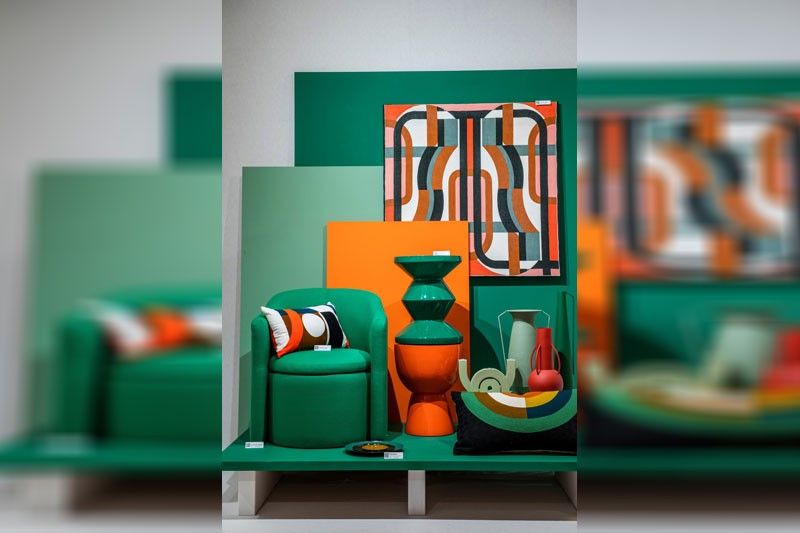
Emerald green, another gemstone shade, has its roots in history, deriving its name since 1598. Mixing blue and yellow, it was sometimes known as “Paris Green,” “Imperial Green” or “Veronese Green.” It was in vogue in the 1800s as household paint and favored by artists like Monet, Cezanne and Van Gogh. Its classic roots have associated the color with refinement, wealth and royalty. Suitable for almost any room in the house, it stimulates thoughts of balance, growth and restoration, aside from bringing nature into the house to encourage unwinding while promoting comfort and togetherness.
Recalling the ’70s, orange has been insinuating itself into interiors, but now there is Princeton Orange, a brighter shade compared to the earlier earthy ones with a hint of ocher. Adding comfort, warmth and fun to a room, it goes perfectly with the Sapphire blue as a complement.
As demonstrated in installations at the trade fair, color can be expressed in monochrome, color blocking and ombré. “We propose ways of putting them together in bold associations and ’70s bohemian-inspired pop, matching geometric patterns and stylized flowers,” says Leriche. “The palette marries green, purple and mauve, elevated by a touch of yellow ochre.”
Geometric appliqué is also combined with undulatory curves in tones of electric blue, Bordeaux or light blue. “Furniture adopts generous and comfortable shapes, notably with rounded seats, lacquered sheet-metal table legs and colored glass tops. Colored glass is very present on coffee tables and sofa ends, while metal holds a place of honor in an aesthetic inspired by the ’80s.”
As a parting note, Leriche emphasizes “the importance of colors for our emotions. In our interiors, we can easily repaint a wall to suit our mood, to refresh or revive a space, using cool or warm colors depending on the light. Light and color cannot be dissociated.”
* * *
Follow the authors on Instagram @rickytchitov; Twitter @RickyToledo23; Facebook - Ricky Toledo Chito Vijandre.


