Tips From Our Fave Interior Designers

They have an eye for space, for scale, for the dramatic and the stunningly simple and beautiful. I’ve seen interior designers walk through a space, and know exactly how to design it, how much or how little to put in there. I’ve seen them lay paintings on a floor, moving them around like a jigsaw puzzle until they get the perfect arrangement, and then put a painting up on a wall that now looks like it was made for exactly that.
Unfortunately, not all of us have that kind of eye. We make mistakes when fixing our own homes — from choosing the wrong kind of lighting to placing furniture against a wall, or settling for plain white walls.
So we asked our fave interior designers for their tips that readers can follow to give their homes a cohesive and interesting look. Interior designers Nikki Boncan Buensalido writes about a flexible nursery; Chat Fores on picture windows and small rugs in big spaces; Rachelle Medina on doing Art Deco right; Pojie Pambid on making ceilings interesting; Nicky Jardenil on mirrors to make walls disappear; Nix Alañon on getting to know your space and color pallete before starting to buy your pieces; and art consultant Miguel Rosales on big paintings in small spaces.
NIKKI BONCAN BUENSALIDO

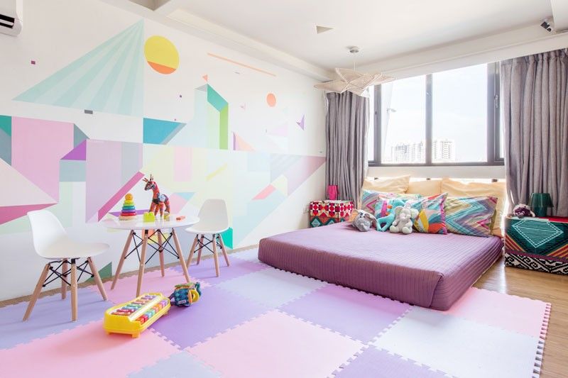
The needs of a newborn baby as he or she grows up changes at an extremely fast pace. In this children’s bedroom, we made sure that the space is able to adapt to the needs of the child from birth. Flexible use of furniture is a must while making sure that all safety measures and precautions are taken into consideration. In this project, we made sure that the child has freedom to move and play around freely in a space dedicated to her growth and development. We also used a mural to give meaning and a splash of color to the space. The choice of color must also be taken into consideration for a growing family. In this project, a major consideration was that the child’s room is to be shared among future siblings, whether a girl or a boy. Moveable furniture encourages curiosity and imagination for the child as she is able to position and rearrange her own things. A bed on the floor, instead of a crib for example, allows the child to take charge of his or her body without being constrained in an enclosed environment. This also addresses the fear of children falling off the bed while asleep or during playtime. It’s a simple practice yet very empowering detail, in my opinion.
CHAT FORES
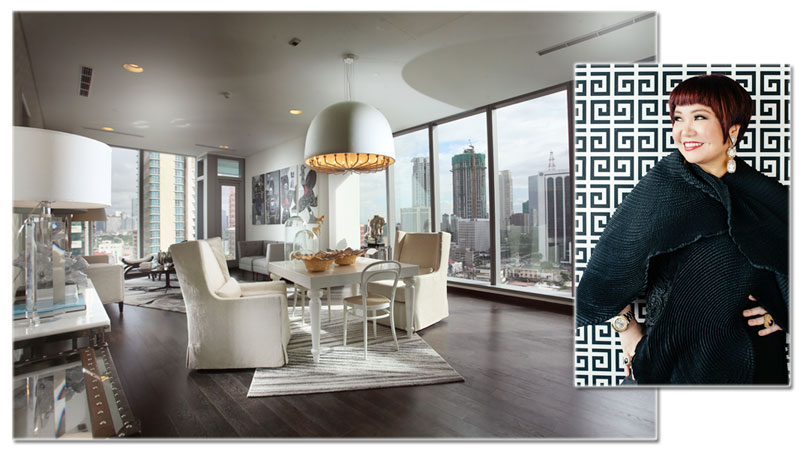
Homeowners fixing their homes should try playing with some pieces and just have fun in the process. Like in the bathroom, consoles don’t need to be boring or plain, but play with reflection and some glossy textures. If you live in a condo with an open kitchen exposed, conceal it with a kitchen system that doubles as a storage. In the bedroom, play with prints and use the same shades and colors; it will still looks monochromatic and safe but not boring at all. You can enhance smaller sculptures by placing them on top of pedestals and highlight them by filling in empty corners; if your rug is too small for the space, angle it to add movement. Finally, take advantage of huge windows by creating your own “picture window.” You can also highlight your beautiful landscaping by creating frames or windows that beautify inside and out.
NICKY JARDENIL
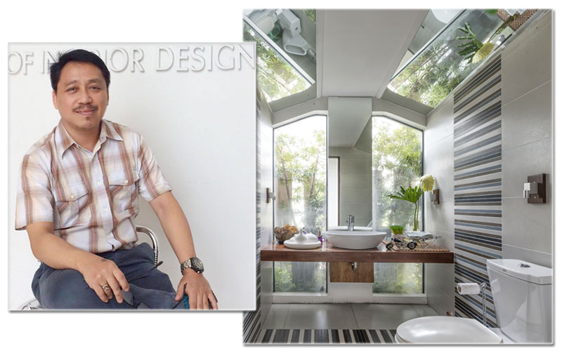
It is a fact that when we use mirrors in interior spaces, it create illusions of height and depth. But how else can we maximize the use of mirrors? In the photo, mirrors were used on the angled ceiling parts of this powder room wherein it reflects the fixed picture window with the garden outside. In effect, it creates an illusion of a skylight on the ceiling. Another tip in maximizing the use of mirrors in interior spaces is to make a wall disappear and making decorative objects appear floating in thin air. You can use a huge mirror to cover the entire wall, which makes the wall literally disappear as it reflects the things in front of it.
RACHELLE MEDINA
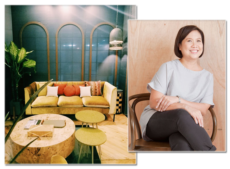
At the last Manila FAME I attended in April 2019, I spotted a lot of Art Deco references to interiors and furniture. Art Deco is a very beautiful design movement, but it does tend to look heavy and a bit too formal when the pieces are in their traditional dark colors with metallic finishes. I think the booth of export company South Sea Veneer did its Art Deco right — it designed streamlined deco pieces but upholstered them in youthful citrus hues, and paired them with light-colored wood and burl veneer. All these give the style a fresh look.
POJIE PAMBID
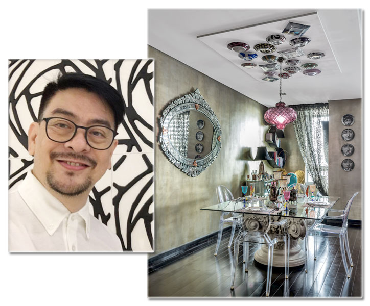
When it comes to accessorizing, ceilings are sometimes taken for granted. But in this dining space, the ceiling becomes a gallery of sorts for a collection of one-of-a-kind antique plates that evoke a sense of elegance and grandeur. The dropped ceiling mirrors the glass-topped dining table on a carved Corinthian capital table base and becomes the frame in which the plates are arranged in a random collage, setting the scene for the sole vintage-colored glass pendant light to illuminate the surface. The result is a quirky and fun ambiance that is guaranteed to set the mood for lively dining conversation.
MIGUEL ROSALES
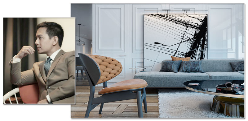
As an art advisor, one tip on how to make a small space look bigger is to place an oversized artwork strategically in a room so that it draws attention away from the space’s smaller proportions. By placing something large in a small room, you trick the eye into thinking it is in fact a larger space. I would love to use large-format fine art photography with grand interior subjects such as those by Massimo Listri or Candida Hofer, which reinforce the idea by using forced perspectives that draw the eye into vanishing points, thereby distracting it from the physical confines of the room itself. Of course mirrors are the easiest way to make a room look instantly bigger, but combined with a large artwork layered on top of this, it brings the room into a whole new dimension!
NIX ALAÑON
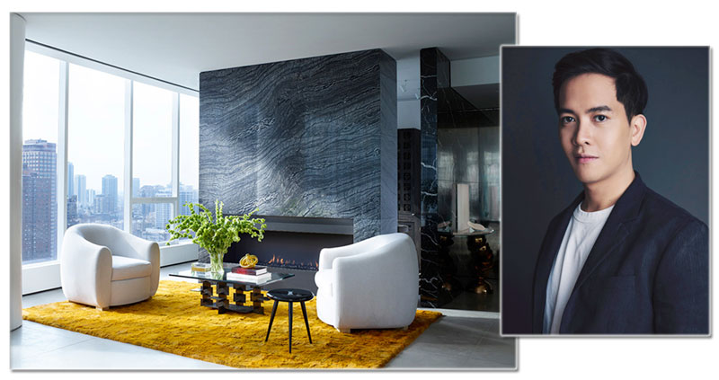
Get to know your space — get the exact measurements of the things you want to put in the space to make sure that they fit. It is important to know the total area of the space and dimensions you are working with, whether it’s walls, floor or distance between furniture pieces. The last thing you want to happen is pick out furniture that is either too big or too small in your space. Have a design idea in mind — it would help a lot to work with a theme so you don’t get confused while sourcing for the things you need. Know which color scheme and finishes you are looking for so you don’t end up buying items that do not match or go well together, or pick up unnecessary things while shopping.


