Pretty Vacant
How Muji built a brand around emptiness
In a society where purging has become an extension of self-care, emptiness is a concept that is at once liberating and terrifying. What are we without our stuff? Who are we without the things that surround us? In December of 1980, Japanese lifestyle brand Muji, ahead of its time, began offering something unique to that decade’s landscape: a no-brand brand that was literally named as such, with reasonably priced products that were understated and made with minimal waste. Initially called Mujirushi (no-brand) Ry?hin (quality goods), the brand that we now know as Muji did not get its official nickname until 1999. With the flamboyant ’80s as its backdrop, Muji quickly established itself as the opposite.
Everything is Exaggerated
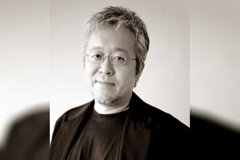
Recently, world-renowned graphic designer, curator, art director and advisory board member of Muji, Kenya Hara, visited the Philippines to talk about the brand’s design philosophy: emptiness. A little background: Japan in the ’80s saw the birth of anime and manga as mainstream forms of entertainment. It was the golden age of video games such as Donkey Kong, Super Mario Bros., shows like Astro Boy and movies like Akira. The economy was experiencing a “miracle” boom, unemployment was at an all-time low, and everything was expensive but consumers were willing to buy. Everything around the world was bright lights and electro pop, and Japan was all that on steroids. “Everything was exaggerated and gorgeous. Muji was modest, plain and minimal, with nothing extra,” said Hara in an interview with The STAR.
Hara describes Muji products as “normal, natural and empty.” Emptiness is the inspiration behind the brand’s aesthetic and its core philosophy, which is rooted in Japanese culture. No wonder all the de-cluttering gurus come from Japan. But according to Hara, “emptiness” is not a purely Asian concept. “There are similar concepts in other countries. China has it, but the interpretation or expression is different. Emptiness is a universal concept.” It’s so universal that Muji now has over 400 retail outlets around the world, and to top it all off, the brand will be opening a third Muji Hotel, its flagship, in Ginza, Tokyo by April 2019, with the first five floors for shops and the top five for accommodations.
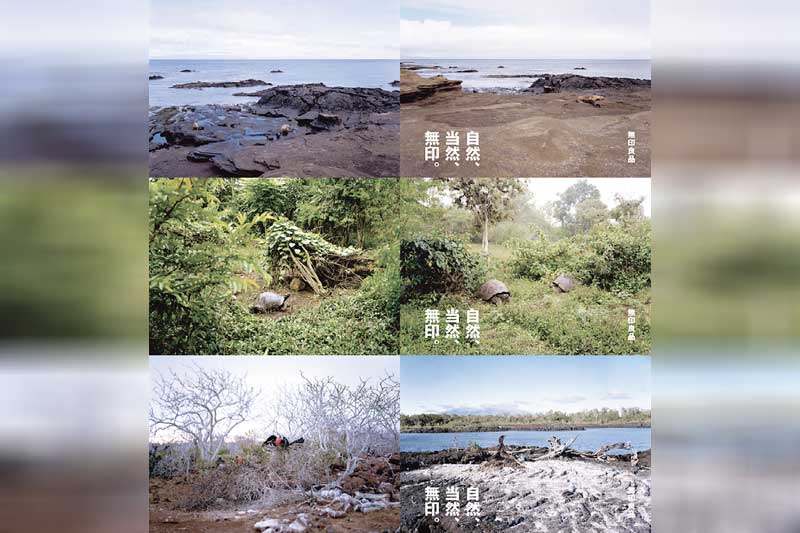
Galapagos (2018) is Muji’s latest advertising campaign, wherein the Muji team explored the islands and its inhabitants’ similarities with Muji’s evolution and individuality.
Does this have anything to do with how much humans are craving emptiness — or at least peace and quiet? Hara says Muji doesn’t create for any specific demographic or purpose — not for the minimalist, not for the hoarder who is looking to purge. “We leave it up to society to accept what we create. It’s up to the consumer to interpret the product.” He added, “Muji is not a brand that has super fans. Maybe subconsciously, but no one is a super fan.” And Hara accepts this as part of the nature of the brand. “If someone has to live in a house where everything is Muji, they will not like it. I myself do not have a lot of Muji items. Things that are immediately around me are not Muji. Muji is normal and I am abnormal,” he joked.
The No-Brand Brand
“To keep the essence of what Muji is is important,” Hara said when asked about how Muji has stayed true to its philosophy throughout the years. In a time when even humans are brands, Muji has avoided any kind of promotion that is not in the Muji DNA. “We have our social media accounts, but Muji won’t resort to cunning ways to gain fans. We don’t do anything more than what is necessary.”
Its latest advertising campaign features a photo of Galapagos taken this year, showing the brand’s journey around the islands to observe the similarities between the island’s creatures and their products in respect to their individuality and evolution. The campaign states: “The emergence of artificial intelligence has thrown lifestyle archetypes into flux. Muji, born in 1980 as the antithesis of saturation and excess, is reconsidering its direction through this direct experience of the world’s transformation.”
A visit to the website will take you around the Galapagos islands through Muji’s eyes, showing raw photos of nature and poetry like “Chaos is a radiant maternal body” in the form of notes. The islands are bare, beautiful in their natural state, and untouched by human influence. In one photo taken on South Plaza Island, there is a sea lion sleeping on the rocks. “It is as if they’re teaching us that it’s all right to have simply sleeping comfortably as the purpose of our lives,” their notes say. It’s difficult to read what direction Muji is taking next, but based on the travelogue, it’s safe to assume the philosophy will remain beautifully empty.
Designing Emptiness
Entering a Muji store is a relaxing experience, and while it’s filled with products — shelves, beddings, notebooks, clothes — it feels like a space that breathes and allows you to breathe. In the design sense, the concept of “emptiness” is neither literal nor negative. It’s a feeling. Calm, quiet, content.
Galapagos by Kenya Hara.
“Almost everything that I see is over-designed,” Hara said. “Just turning on the TV or looking at your smartphone… you’ll see all these apps. Somebody designed it, and of course they try to streamline, but there’s still so much. You turn on the internet, and banner ads come at you. I can’t understand how people are okay with it. It’s so noisy. I think Muji exists to advise people that ‘This is enough’ or ‘This will do.’ I think that is Muji’s role.”
Muji makes it look easy. We see a bed in the store, and it’s a bed. Rectangular, flat, and of good height. What we don’t see is the process that goes behind the making of this bed, which looks like the most straightforward bed ever made. “It’s more difficult to make Muji products than a product that’s unique in the world,” said Hara. “It’s hard to make something so simplified but comes across as attractive. When you make something so simple, sometimes people interpret it as a product of a shortcut. It’s just a circle. It’s just a square. It’s difficult to make people see what we make and say, ‘It’s so beautiful, I have to have it.’
“For example, making a Muji notebook with lines. We think, how thick should the line be? How far apart should the lines be? Should the lines be straight? There’s so many things to consider. But when you perfect that, it’s like air. And that difficulty will not be noticed by people.” He added, “It’s like having so many condiments in front of you, and someone says, ‘Make water.’”
Emptiness is expressed in Muji products in different ways — ways that the brand would not dictate to the consumer. For the brand, it’s all about the individual experience. It’s that intangible feeling one gets when wearing a starch white pair of Muji sneakers, or when one looks at a collection of perfectly stacked Muji drawers. As Hara says, it’s like air.
* * *
In the Philippines, Muji is exclusively distributed by Muji Philippines Corp., a member of SSI Group Inc., and is located at Greenbelt 3, C1 Bonifacio High Street Central, Power Plant Mall, and Shangri-La Plaza East Wing. For information, follow facebook.com/muji.ph or @muji_ph on Instagram.


