Making room for baby

What I love about decorating a baby’s room is that you can let all your fantasies come to life. When Sebastian was born, I had imagined my dream room: one that inspired adventure and discovery in that classic old-world way. With vintage travel posters, hot-air balloon wallpaper, and leather suitcases as makeshift tables, I wanted everything to be beautiful and warm. I spent so much time in there, playing with him. It was truly my favorite room in the home.
When Maxi came along, it was the same process. I had imagined a jungle safari with Scandinavian elements in a lighter palette. In the end, it ended up becoming another favorite room in the home and we would go on our adventures from “travel land” to the “deep dark jungle.” These whimsical rooms truly contributed to sparking their imagination and sense of play.
We’ve rounded up some beautiful baby rooms and design tips from these savvy moms.

Stephanie Kienle-Gonzalez
Philux Inc. @stephkienlegonzalez
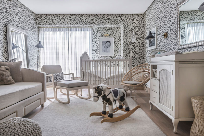
“I was inspired by this striking wallpaper. Once I stumbled upon it, I decided it was going to anchor the whole room. My first daughter’s nursery was very French, pink and feminine, so I opted for something very different for my second child. Because the wallpaper is evocative, I kept everything else in muted whitewash tones or black to complement it and made things interesting by adding texture to the monotone neutral palette. I still wanted an airy feel to the room, so I added sheer curtains and some natural materials like the peacock accent chair that I found in South Africa. Prints of adorable wild animals hang above a day bed — the same one used my first daughter’s room. This space makes us all happy because it has its own unique look and feel, which separates it from the rest of our home. It also reminds us of one of our favorite places, South Africa.”
Audrey Pastelero
Fun Nest @audspastelero @funnestph
“The inspiration for this nursery was the book Goodnight Moon which was Theo's favorite bedtime story. I drew inspiration from the book and made sure we had each element to say goodnight to. It actually became a sort of fun bedtime routine for us, too. I started off with painting one wall with relaxing shade of green, but couldn’t quite let go of the gray wall at the time. In the end, the two-tone room seemed to work out. The socks and mittens were his when he was still a newborn. The moon is a dimming lamp we used as a night light, the comb is actually the one he uses, the alphabet wall is from decal bar, the vintage luggage — that double as a table and storage — are from his great grandparents, and the telephone was something I made in a pottery class. I covered his entire floor with Booboo Proof Play wooden mats to brighten up the room and add safety. Almost everything else like the shelves, teepee, canopy, bed, ball-pit, boat, hampers and pillows were custom-made. When I zone in on a project or theme, I get quite particular with details. So, instead of scouring websites and malls, I find it more convenient to sketch up exactly what I’m looking for and have our friends over at the Fun Nest headquarters whip them up. That’s actually how most things end up on the site.
Cristalle Belo-Pitt
Belo Medical Group @cristallebelo
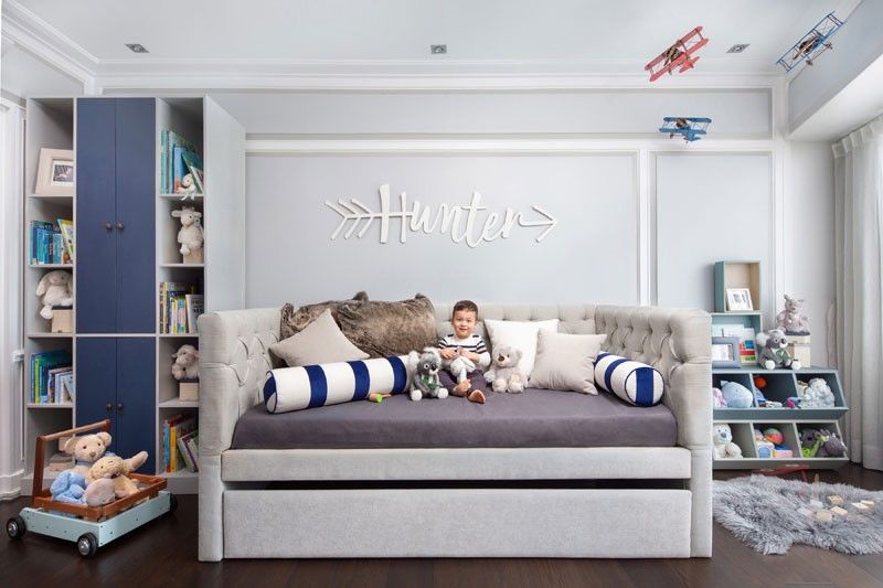
“My love story with Justin was a romance around the world. We met in Abu Dhabi, he then moved to China, then to Cambodia. It was a lot of travel and adventure for the both of us. So when we were thinking of a theme for Hunter’s room, it was more about movement, travel and adventure focused on hot air balloons and airplanes. Justin also wanted to be a pilot when he was younger and that’s why this theme is nostalgic for him. The focal point of Hunter’s room is this hand-painted wall by Alfred Galvez and his team. To make the theme come to life, we sourced an actual wooden propeller, which we attached to the main airplane in the mural. We also had tin vintage style biplanes depicting a dogfight with the Red Baron, suspended from the ceiling. Lastly, we had Hunter’s name laser-cut in wood. We incorporated the arrow in this wood carving because he is a Hunter. Justin and I worked closely with interior designer Samantha Tan (SMTH/designs) to make this nursery come to life. The colors were inspired by the colors of the sky: sky blue and white with different hues of blue.”
Interior Design and Styling:
@babytopiaph by SMTH/designs
Samantha Tan
Contact: +63 917 565 6939
smth.designs@gmail.com
Photographers
Marc Henrich Go @marchenrichgo
Eric Beltran @ericbeltran_
Fox Lounger: @pottlyntubby Crib: @stokkebaby Table: @oribelph Accessories : @shopgrassrootsph @littlestsetters Hunter’s outfit: @petitbateaumanila Favorite sleep helper BunBun: @babysleep.ph

Carmela Villegas Agosta
Casa San Luis Pastries @mariacarms
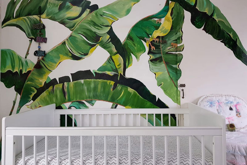
“As we made the decision to wait until I gave birth to find out if we were having a boy or a girl, we looked for gender-neutral nursery pegs. We chose white and cream colors for the furniture like the Philux changing table and the mint green rug for a pop of color. The highlight of the room is the mural that I painted with my artist-friend Solenn Heussaff-Bolzico. I wanted a tropical design because I found it relaxing and something my daughter could grow up with. We matched the colors of the banana leaves with the rug. We avoided choosing bright colors since babies are very sensitive to them and wanted her to have a calm and serene environment to sleep in.”
BOXED FEATURE:
Tips For Decorating And Dealing With Baby Clutter
“Think function first — focus on the key elements such as the crib, changer, sofa or day bed and rocking chair. From there, add furniture that can be used for storage as well, because you cannot have enough storage in a child’s room. For decoration, work around a color palette that you love — in my case, I went for something bold and therefore the wall print ended up being the focus of the whole space, and the decorative elements around complemented it well. For clutter, multifunctional pieces and clever storage solutions are imperative. A day bed with drawers and stackable containers in the closets are recommended.” — Stephanie Kienle Gonzalez
“My rule of thumb is to start with a neutral base or something easy to work with, and stick to a color palette. You want your baby calm in their room and not over stimulated. At the end of the day, it's a place for sleep. I have an obsession for keeping things neat and tidy at all times so it’s sort of a rule to put things back where they came from after playing. I personally feel like habit-forming is key to keeping a place tidy. I also take photos of how I want things arranged and send it to our helpers so they know exactly how to put everything back.” — Audrey Pastelero
“Keep a lot of free space so that the child can run around. Don’t over-clutter the room. Have set corners or areas for different activities- changing, reading, and sleeping. I think it’s important to design it in a fun and whimsical manner so that you and the child enjoy spending a lot of time in the space. In Hunter’s room, nothing is permanent. It’s extremely dynamic and we continuously move pieces around and sometimes sell things. I also believe in rotating toys (put some out and keep some in storage), so that the child feels there’s always something new and different. It’s great seeing Hunter play with the same toy in a different way because he’s in a different life stage when he encounters the toy again.” — Cristalle Belo Pitt
“Choose a comfortable nursing chair and decorations pleasing to the eyes. Don't forget you’ll be spending many sleepless nights there.” — Carmela Villegas Agosta


