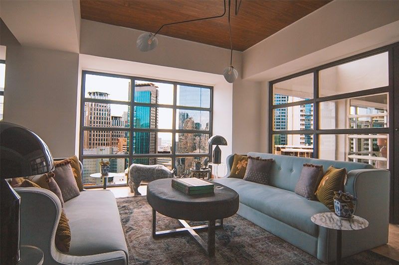
#DreamHomeGoals: Interior design hacks for any budget and space

MANILA, Philippines — Impossible as it seems, one doesn’t need to break the bank to have a home that looks straight out of a magazine page or movie scene.
The chic interiors that decorate glossies were probably crafted by world-class designers and photographers; it’s understandable if our idea of a dream home is “unattainable.”
Nonetheless, achieving a professionally-made look for living spaces doesn’t require a new set of furniture or even expensive materials.
As proven by interior decorator Peggy Pardo – who runs the home decor and DIY blog The Casa Collective – all it takes to start is some resourcefulness, an understanding of basic design principles, and knowing what you want.
The Casa Collective is behind Casa Lafayette Apartment, a space found in 105 Tordesillas Street in Salcedo Village. Casa LaFayette is at the center of a community teeming with the most inspiring and stimulating experiences. It enables homeowners to indulge their senses at the nearby organic market; energize themselves with activities at the Makati Sports Club; and satisfy their cravings as spots like Starbucks, Bruno’s Barber Shop, Piandree and the Salcedo Market.
Here are “simple but powerful” tips from The Casa Collective guaranteed to take any home to new heights with little to no cost.
Bedrooms
The bedroom is sacred. Each day starts and ends here, so it makes sense to keep it a place of rest. Comfort is key.
Bedrooms evoke a plain beauty by incorporating symmetrical balance and limited decoration that do not overwhelm the eyes.
The obvious focal point here is the bed. An imaginary line can be drawn from the center of the bed that allows you to imagine the space and any surrounding decorations to complement this singular most important feature.
It would be unwise to place a large piece of furniture like a cabinet or couch directly next to the bed as it would disrupt the room’s harmony. It is more appropriate to place subtle and useful decorations like wall or desk lamps and nightstands no taller than the bed.
Vertical space can also be taken advantage of with small portrait or two hung on an otherwise bare wall. A DIY (do-it-yourself) headboard would further accentuate the bed while also making the wall seem less empty.
For those with more space, a sitting area can also be fashioned with the remainder of the bedroom. A chair or two placed opposite from a coffee table with about the same width, all over a rectangular carpet would add a second focal point to the bedroom that doesn’t necessarily steal attention from the bed area.
Bathrooms
Unlike bedrooms, bathrooms are more complicated to decorate since these are designed around objects with different visual weights, namely the bath and/or shower, a toilet, a sink, and features that vary per bathroom — all usually compressed into a tight space.
Here, vertical space, color, and grouping of similar objects need to be utilized to maximize the limited area.
The minimalist approach is to unify all the disparate fixtures, e.g. towel rack, toilet paper holder, trash bin, open shelves, mirror edge, shower, with a dark painted color in stark contrast to the rest of the bathroom.
This creates a regal quality that employs judicious use of a distinct color like black while making the white space seem much cleaner and spacious.
One can also go the other extreme and get quirky with the bathroom design, repurposing vintage doorknobs and decorative hooks as towel racks to add an ingenious yet functional charm to the small space.
Open shelves, as opposed to tired cabinets, can be installed above the toilet (the higher, the better) and topped with towels, soaps, toiletry holders, and bath items with a similar size.
Kitchen and dining areas
Kitchens, as compared to the rest of the household, are more stressful due to objects that vary the most in terms of size and function.
Fortunately, one can still create harmony by grouping smaller objects such as plates and containers on open shelves that balance larger, visually-heavy kitchen fixtures like refrigerators, stoves, cabinets, exhausts and microwaves.
Food and ingredients should be stored properly away from sight. Keep counters as clear as possible and pay attention to the rhythm created by kitchen tools and fixtures of similar material, color, or appearance, e.g. metallic, wooden, granite, etc.
A colorful bowl of fruits or some wine bottles would be enough to spruce up countertops, which otherwise should be kept clear.
Dining areas, depending on the table size and shape, as well as the number of household members and the room’s shape, usually have a symmetrical or radial balance.
The dining table should be kept clear, save for objects that keep the center as the focal point. A tall fruit, vase, or basket of food or fruits would do the job nicely.
Living rooms and common areas
Common areas, including living rooms, family rooms and foyers offer the most versatility and depend on what occupies a person, couple, or family’s time.
Symmetrical balance is perfect for families who regularly watch television together. This works best with a standard couch or other large piece of furniture, sitting opposite a television hung on a wall or placed atop a cabinet uncluttered by other objects. A coffee table and carpet or large rug would tie up the room in neat proportional shapes.
A radial balance, however, would better suit lifestyles who aren’t fixated on television and prefer face-to-face communication to entertain guests. Here, any table would serve as the focal point instead of a television, surrounded only by chairs and other objects with similar visual weights that neatly border the table.
Unlike other parts in the house, living areas are made for leisurely activity so be liberal with decorations and colors. Breathe life to walls and shelves with paintings, pictures, books, vases, and other personal items.
Pro-tip: To make living spaces feel much roomier and well-lighted, a large mirror propped against the wall is valuable.


