Why DOT retained the Barabara font in ‘Love the Philippines’ tourism campaign
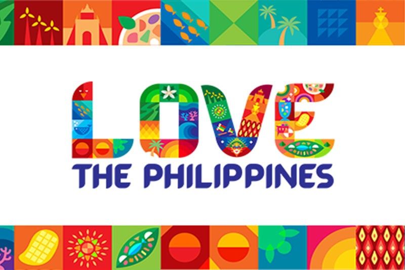
MANILA, Philippines — The Philippines just got a rebranded tourism campaign, but some of the elements of the past tourism brand remained.
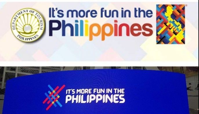
The Department of Tourism launched “Love the Philippines,” dubbed the “enhanced” tourism campaign last Tuesday. This follows the successful predecessor “It’s More Fun in the Philippines.”
Like in the past tourism brand, the DOT used the Barabara font which was inspired by hand-painted street signs usually found in jeepneys. This time, the new logo was made colorful and bears icons of the Philippines.
Barabara font, meanwhile, was launched in February 2019 when the DOT under former Tourism Secretary Bernadette Romulo-Puyat, revived the new logo with the customized typeface that makes it more “readable for everyone."
It followed the past font used for the “It’s More Fun in the Philippines” called “Harabara.”
Since then, Barabara was used not just in the “It’s More Fun in the Philippines” logo, but also in other efforts to promote the Philippines.
The current DOT administration said that it recognized the effectiveness of this font.
“The only way to truly honor the Philippines and Philippine tourism is to honor those as well who have exerted so much time of sacrifice, service and effort towards building up the tourism industry. We recognize the contributions of all of our former secretaries, which we've done this evening who in their own ways have honored the Philippines through tourism,” Tourism Secretary Christina Frasco said
“One of those accomplishments is actually coming up with this particular font that is distinct to the Philippines and this is known already all over the world. And so we capitalize on its success,” she added.
Despite this, however, the DOT said the rebrand was warranted given the demands of the industry after the COVID-19 pandemic. The health emergency changed the travelers’ motivations, preferences and behavior.
Frasco said the agency conducted local, regional and global studies that determined the “changed traveler,” hence, the move to replace the country’s tourism campaign.
“We will continue to market the Philippines as fun all over the world. But we will also articulate that the Philippines has so much more to offer in addition to fun and that is why we are honoring our culture, our history, our heritage, our people, our flavors and all our other tourism offerings,” the tourism chief said.
"And we feel that the use of this font that is very familiar to everyone already as it is, what the Philippines is known for will help us in continuing to campaign for Love for the Philippines,” she added.
Is 'Love the Philippines' a demand?
Meanwhile, asked whether “Love the Philippines” is a “demand” to tourists, Frasco in a televised interview denied it. She said “love is a natural thing that must emanate from the heart."
The social listening of the DOT and the agency that created the new tourism campaign, DDB Philippines, also found that “love” is the word the public is associating with the Philippines.
“You cannot ‘demand’ love. It is a natural thing that must emanate from your heart. ‘Love the Philippines’ goes to the heart of every Filipino that loves their country. You can no more force one person to love their country in the same way that you cannot force them to love themselves, or somebody else. It is a natural feeling that must come from your heart. And we truly believe that in reflecting our love of country in our new tourism tagline, we would be able to reawaken in our fellow Filipinos their own love of country,” Frasco said.
She also reiterated that the new tagline is the Philippines’ “love letter to the world.”
Frasco said the new tourism campaign's entire study comprising the logo and other components of the branding costs P49 million. The contract for the rebranded campaign was awarded to the winning bidder DDB Philippines.
- Latest
- Trending


