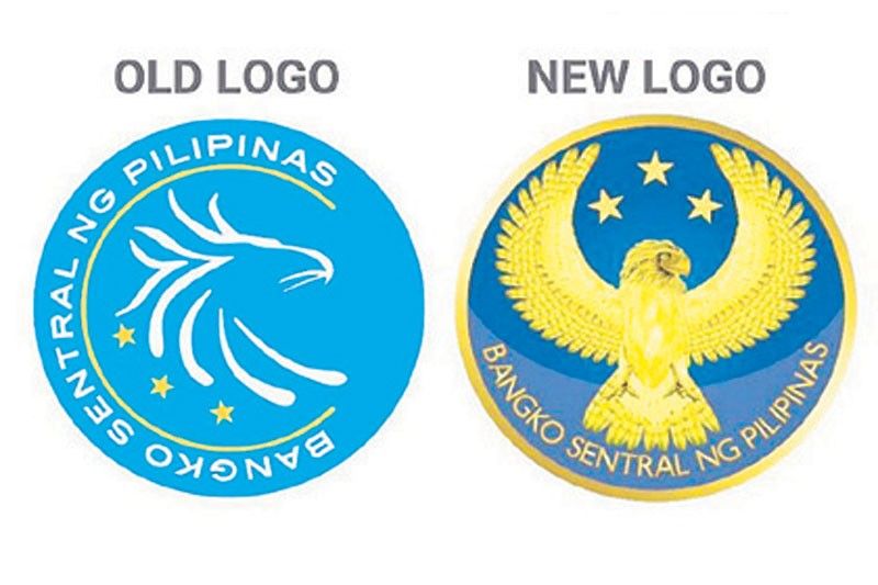
BSP changes logo

MANILA, Philippines — The Bangko Sentral ng Pilipinas (BSP) yesterday introduced a new logo featuring a full-bodied Philippine Eagle, which immediately drew flak from netizens because of its similarity with the US Department of Defense logo.
At a virtual press conference, BSP Governor Benjamin Diokno said the new logo features a Philippine Eagle rendered in gold, taking inspiration from various wildlife photographs of actual Philippine Eagles, unlike the current one that has the stylized eagle profile design.
Diokno said the use of the Philippine Eagle in the new logo is intended to represent the BSP as well as the Filipino people that it serves.
“While the strong foundation of the BSP brand remains the same, its visual representation in the form of the logo requires an update to infuse the institution with renewed vitality, underscore its integrity and competence, and further promote the understanding of its mandates,” Diokno added.
He told reporters these are likewise consistent with the 2020-2023 BSP Strategy that focuses on making the BSP more relevant to the Filipino people, as it pursues its mandates in support of a sustainable and inclusive growth of the economy.
Since the proposed logo is a brand refresh rather than a total rebranding, the elements of the current logo have been retained: the eagle, the three stars and the circular shape.
The major changes in the proposed logo are in the orientation of the eagle, the placement of the stars and the introduction of the gold color.
According to the central bank, the implementation of the new logo would be done in phases, details of which will be announced in January.
The current logo, which was introduced in 2010, would still be used in the meantime.
The BSP added the new logo was endorsed by the National Historical Commission of the Philippines prior to Malacañang approval this month.
The design of the new logo drew flak from netizens because of similarities with other eagle logos and designs such as that of the US Defense Department.
@flailingoldman tweeted “The old one is okay,” while @moncafealde said, “Keep the old logo. It is more appealing, clear and economical when it comes to printing.”
“If it ain’t broke, don’t fix it!” said @ActivJc, while @whatsupjared commented “I’m curious why the body portion of the Philippine Eagle seems off?”
On the other hand, @WalaAkosi said “the old one looks like unique and symbolic than the new one looks like a logo of liquor.”
- Latest
- Trending


