Special: DragonFi web broker review
DragonFi's marketing pitch is that this is a platform "built for the serious investor." It's presented as being the place traders go when they're ready to step out of the tutorial level (COL/GStocks). They've got best-in-class technology, high-profile personalities as co-founders, and a wealth of goodwill (owing in large part to those personalities).
And yet, like I mentioned in my PSE EQUIP review, users don’t care about marketing, or the intentions of the founders, or what the app or service could do in the future.
Users will give up on confusing navigation flows, slow load times, or any number of other minor inconveniences that can contribute negatively to the overall experience. Users don’t care. They want something that is reliable, easy to use, and that adds value to their investing strategy.
This review is from the perspective of a random user, with absolutely no skin in the game.
Short review
For those that just want the MB BOTTOM-LINE, here it is:
DragonFi is so good it makes me angry. Not because the platform does anything wrong, but because it shows that it is possible for a local company to deliver a world-class brokerage product, and that it's probably been possible this whole time. It’s a powerful trading platform capable of doing a lot more than what 90% of traders will even want, but crucially, it does 100% of what all traders need. And it looks like it does it well, with style, and in a way that just makes sense. That said, the pitch of DragonFi as “next level” trading is not a lie; the system could be a little intimidating to people that have never traded before. New investors looking to hit a big green BUY button on some meme stocks might be frustrated by the fantastic detail and control that the platform provides to traders that have a more active style.
If you’ve ever complained about COL being too basic or that the whole brokerage industry seems to be decades behind the rest of the world, DragonFi is worth your attention.
Long review
For those that want a more page-by-page breakdown of the platform, and a better feel for my likes and dislikes, buckle up because here we go!
I've tried to include a screenshot of each section to give you an idea of what it looks like, but DragonFi is a beast that is best experienced on a multi-monitor setup, and that's a difficult setup to capture adequately through some 560px-wide screenshots.
Seeing is believing. Just keep that in mind!
1. SIGN-UP PROCESS: Even though I was given dev access, I still did 95% of the sign-up process (minus the photo ID and video selfie), and it took less than 10 minutes. All of the questions seemed reasonable given the context.
The only thing that threw me for a loop was the need to complete a margin trading agreement as part of the onboarding flow. I asked DragonFi about this, and they said that the agreement was put in due to the long lead times on getting margin accounts approved with the SEC. Cash accounts are the only type available for now.
MB Quick Take: No sign-up is ever fun, so it’s more a function of doing the bare minimum needed to get through to the next stage with the lowest degree of displeasure and inconvenience possible. From that perspective, DragonFi does the job. The margin account thing is still a little odd to me. For those that don’t know, trading on margin is when a trader borrows money from a brokerage to place a trade. It’s a relatively advanced technique that comes with an increased risk profile, but that being said, it’s not like margin accounts require users to trade on margin, so there’s probably no downside to filling out the form. Aside from the confusion. I think that this form could cause some confusion. That said, the DragonFi team said that sign-up is engineered to take 30 minutes or less, even with the ID verification stage, which really is unmatched. I just couldn’t confirm that as part of this test. Everything else was great and easy.
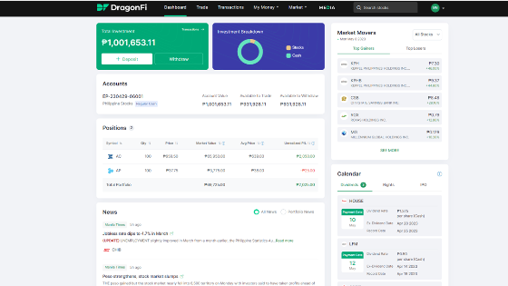
2. DASHBOARD: The main screen highlights your total account value and investment breakdown (between asset types), and provides a very quick overview of the available cash you have to trade, and the available cash you have to withdraw. It shows your current positions in a clean and easy-to-read table, with helpful definitions on mouse-over of section headers.
The top right panel shows the Market Movers, which is a pass-through of data from the PSE’s Top Gainers and Top Losers section, and beneath that, there’s a Calendar that can be toggled between Dividends, Rights offerings, and IPOs.
At the bottom is the News panel that aggregates news from leading publications about PSE companies. It can be filtered to show news from all companies, or just those that relate to companies in your portfolio.
MB Quick Take: This screen is where DragonFi shows its understanding of the importance of information, layout, and flow. It’s also where the next-level design starts to play a role in making DragonFi useful as a platform. Little touches, like not requiring the user to leave this page to check different calendar items, or being able to toggle news to be just about your stocks -- it just makes sense. The Dashboard screen doesn’t try too hard to do everything for everyone, it just gives enough information to (like a real dashboard) let you figure out what to do next. Going deeper into any area of the dashboard is easy, just like “SEE MORE” and... you do.
Dashboard screenshot:
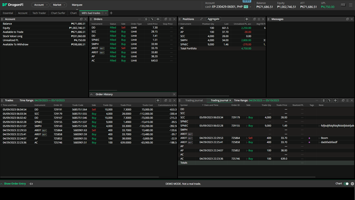
3. TRADE: This is where users “do the thing”. Where you go to buy, sell, laugh, and cry. Right away it’s obvious that DragonFi draws a great deal of aesthetic inspiration from the dark Bloomberg Terminal look (which was also adopted by modern crypto exchanges), but the look sets the appropriate tone. The software that forms the foundation of this section is complex and powerful. The trade portal is fully configurable. Each of the sections is its own widget that the trader can drag and drop across the trading “screen”, including multi-monitor support for those that have that kind of trading rig. There are Account-related widgets like Orders, Positions, and Trading Journal, and Market-related widgets like Chart, Watchlist, News, and Broker data. Orders are entered, and any fills are communicated by convenient overlays on the top right of the screen (check the screenshot) when they happen, just like you’d get on Binance or any of the other cutting-edge platforms.
MB Quick Take: I got the same thrill opening this beast that I got when I opened the trading tab on my Binance account for the first time. That feeling of being “closer to the metal” than I’d ever been before. Despite how elite this trading portal is in terms of making and executing trades, where I feel it has the most potential is in the Trading Journal section. This tracks all of your buys and sells, and allows the trader to apply (with just a click) a “tag” to the trade (like “News”, “Impulse”, “Strategy”, “Market Event”, and “Error”), and to enter a detailed note-to-self right there in the journal. How many times have I diverged from my baseline strategy for a particular reason, only to forget to note my thesis/thinking for the trade in the moment and then eventually forget the thesis/thinking altogether? To this day I’m not even sure why I bought BDO when I did. I mean, I made money on the trade, but how do I evaluate that trade in any constructive way without some data on what prompted me to enter the position, and what my thinking was at the time? As someone who is easily distracted and struggles to stick with a process, having the ability to give “future me” the context of a trade right there in a live widget as I make the trade is invaluable. Maybe that’s not something that appeals to you or your trading style, but it really speaks to me, because I found that I didn’t improve as an investor until I started to track the accuracy of my thinking, not just the performance of my positions.
I really can’t overstate this: DragonFi’s trading platform is the best in the country, and it’s not even close. It’s going to be most noticeable for short-term traders and high-volume traders, but (IMO) there isn’t a single retail trader now doing anything locally on a system that touches this one. This is as close to pro as you’re going to get here.
But this is also where DragonFi will pose a challenge for some users. That same “thrill” that I got the first time I opened Binance was, in part, because I knew that I was (to use a crude phrase) being given enough rope to hang myself. DragonFi is like a Ferrari in that way. DragonFi understands this, and they’ve included an “Essential” widget configuration option that strips out all the extras and brings the system back down to its basic parts, but even then, you still get the impression that it’s still the same Ferrari, just limited to the first three gears. For someone just learning how to drive, a Ferrari in 3rd gear is still powerful and intimidating.
Trade portal screenshot:
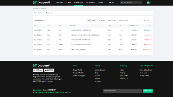
4. TRANSACTIONS: Here users see all of their completed transactions (buy and sell orders), with quick-view buttons to filter out the last 7 days, last 14 days, and last 30 days. It also allows you to pick a month, or to export the whole thing in Excel format.
The Requests tab shows all of the IPOs and Stock Rights Offerings that the user has requested allocations for, and the current status of those requests.
MB Quick Take: All the info is just here. It’s easy. I’m not sure why doing this is so hard for some brokers. Like with COL; they let you see last 2 weeks, a single month, or a single day. What about my entire history? What if I’m a long-term trader and I’m not super active on a daily basis? I think this is actually a good demonstration of how DragonFi’s UI/UX experience laps its competition: it does the simple stuff right, and in a way that just doesn’t become yet another problem for the trader. Using the DragonFi system doesn’t feel like trying to perform surgery with your non-dominant hand. It just works like you’d expect it to. Without being weird about it. Maybe it would be nice for an “ALL” button just to be able to scroll all my transactions right then and there, plus, it might be interesting to be able to filter my transactions by “tags” (and maybe even see my notes?) to be able to really do a self-evaluation of my trading strategy. DragonFi has the ability to make some small changes to really make regular review a much easier (and insightful) exercise.
Transactions screenshot:
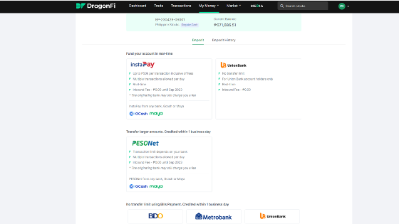
5. MY MONEY: This is where you get money in and out of your account. For deposits, there are four options (InstaPay, PESONet, UnionBank transfer, and bills pay transfer (BDO, Metrobank, and UnionBank). Fees and transaction limits depend on the option, but the fees for InstaPay and PESONet have been dropped to nothing up until September. DragonFi says that UnionBank transfers are “real-time”. Deposits with bills pay are credited within a day. Deposits also are possible through Maya and GCash.
On the withdrawals side, users can link their bank account to the DragonFi system, and request withdrawals for direct deposit to their selected account. Both deposit and withdrawal pages have a history tab that allows the user to easily see their transaction history with DragonFi.
MB Quick Take: I was only on a dev account, so I wasn’t playing with real money. I didn’t go through the process of trying to transfer my stocks from COL to DragonFi, I didn’t get to test how quickly the team would credit my account for a thick bills pay transfer, and I didn’t get a chance to experience how easy/difficult it would be to link my bank account for a withdrawal. Because of that, I didn’t get a good feel for how smooth or crunchy the process would feel, and I didn’t see if there were any additional fees that aren’t shown on the page. Based on my talks with DragonFi’s team, it seems like funding the account would progress as quickly as the PH banking system would allow. I like that it’s very easy to see the status of deposits and withdrawals. When money is involved, it’s important to be communicative and transparent.
My Money screenshot:
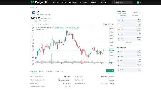
6. MARKET: This is sort of a catch-all for the data streams that users get a glimpse of on the Dashboard screen. From here you can see News (except now with the option to filter news for a customizable set of companies, not just those that are in your portfolio), the full Calendar (with dividends, IPOs, and stock rights offerings), and then “Sectors”, “Industries”, and “Themes”, which are groupings of stocks that users can scroll to get investment ideas. The Themes section acts as a market screener, and applies filters that DragonFi designs and curates. As of this writing, the themes available were “New 52 Week Low”, “New 52 Week High”, “Foreign Accumulation”, and “Relative Strength”. Finally, there’s the “Stock” page, which is where users can get the regular technical stock info like price, volume, and outstanding shares, but also a much deeper (and accessible) collection of data like financial metrics, revenue contribution by business segment, and valuation metrics.
MB Quick Take: I found myself constantly surprised by the depth of the data available for each company. I didn’t test all of the PSE companies to verify that they had the same depth of data, but I spot-checked several and found that the detailed financial and valuation metrics were available for each, and that (more impressively) the business segment information was available for each. This presentation feels intuitive and usable. The system isn’t just serving up a dead PDF like PSE EQUIP that needs to be loaded, scrolled, and searched; it’s organizing the data and serving it in real-time. I don’t think this kind of data is available on COL, and if it is, I haven’t figured out the correct incantation of obscure menu navigation choices that would lead me to it. I’m also excited for the possibilities that could come from the “Themes” section, which could end up being a topical playbook of suggestions that is curated by DragonFi, like Spotify suggested playlists. I think that’s very interesting. But, imagine if users could submit themes, and have those themes reviewed and rated by other users. It feels like this section has a lot more promise than the stock photos would indicate.
My only suggestion in the Stocks section is to make the default “All” so that any searches for non-PSEi companies don’t return a confusing “No results found”. Otherwise, this is a superb minimum viable product when it comes to integrating information from all these different data streams.
Market screenshot:
7. OVERALL: Even though DragonFi describes this as its “minimum viable product”, this feels more like a finished product than most of the brokerage sites that I’ve used here. The presentation is clean, the information is well-organized, and as a user it didn’t feel like the platform was playing any games with me. All of my data felt like it was my data. It didn’t feel like I needed to trick DragonFi to tell me my transaction history, or go on some menu navigation expedition to hunt for some basic data that should be available as a matter of course. DragonFi feels like something that is willing (and able) to go as fast as I want to go, without complaining or slowing me down simply due to its frustrating layout or technical limitations. It feels like something that gave me more than I needed, and never once delivered less than I expected. There are some spelling errors, and the dev site had a few Shutterstock images in prominent places, but the overall competence on display in the execution of the platform as a whole leaves me with the impression that these little rough edges are just things that will be fixed, and not like each little error was a microcosm of some deeper fatal flaw in design or approach. This is something that you can use, right now, to make your trading experience better.
As I’ve said before in this review, I didn’t get a chance to test the system under “live-fire” conditions. Will the servers melt if there’s a sudden market-wide rush to buy junk mining stocks? Will deposits work quickly and without issue? Will withdrawal requests progress without issue? These things I can’t know, and anyone reading this should take that into consideration. This review is also just a snapshot in time. The DragonFi system may change, or the policies of the company may change in ways that either address issues that I’ve raised, or raise new issues that I haven’t even talked about here. One such issue could be the fees associated with deposits after the zero-fee promo ends in September. What will the fees be then? I can’t tell from here. It’s just something to be aware of.
MB BOTTOM-LINE: From a trading perspective, I can’t think of a tool that I’d rather use. If you’ve ever wondered to yourself what trading the PSE would feel like on an international-grade trading platform, here it is. If you’ve ever uttered a curse as you fumbled through confusing navigation options to try and see what you’ve done and how you’re doing as a trader, give this a shot. DragonFi is a newborn, but it’s off and running like it’s been here from the beginning. I commend the DragonFi team for their tech-first approach, and for having put so much obvious thought into how traders would actually use a system and then building DragonFi in that image.
That said, even DragonFi would admit that the system might not be for everyone. They’re doing some work to try to make the Ferrari more accessible, but I didn’t see any of the tutorial content yet that could help inexperienced traders use the system with more confidence. The minimum account balance (P25k) might be too steep for some. The interface might not be basic enough for some to feel comfortable. The fees might rub some people the wrong way. No broker is perfect, and no platform is for everyone. DragonFi is no different in that regard. Every person needs to make a decision that fits their own needs and priorities.
I guess the best way I could put it is this: if your priority is raw power and control, you can’t get any better (right now) than DragonFi. It’s a platform best suited for active traders and is geared toward those who are looking to improve their skills as investors. If PSE EQUIP was bland lugaw, then this is one spicy meatball!
--

Merkado Barkada's opinions are provided for informational purposes only, and should not be considered a recommendation to buy or sell any particular stock. These daily articles are not updated with new information, so each investor must do his or her own due diligence before trading, as the facts and figures in each particular article may have changed.
- Latest


